US racial/ethnical dot map in Neighborhood Facts
We published the Neighborhood Facts App (link) a couple of months ago. Through the App, you can check the socio-economic statuses of neighborhoods in the United States and Canada. In our most recent version, we have incorporated the racial/ethnic dot map in our App.

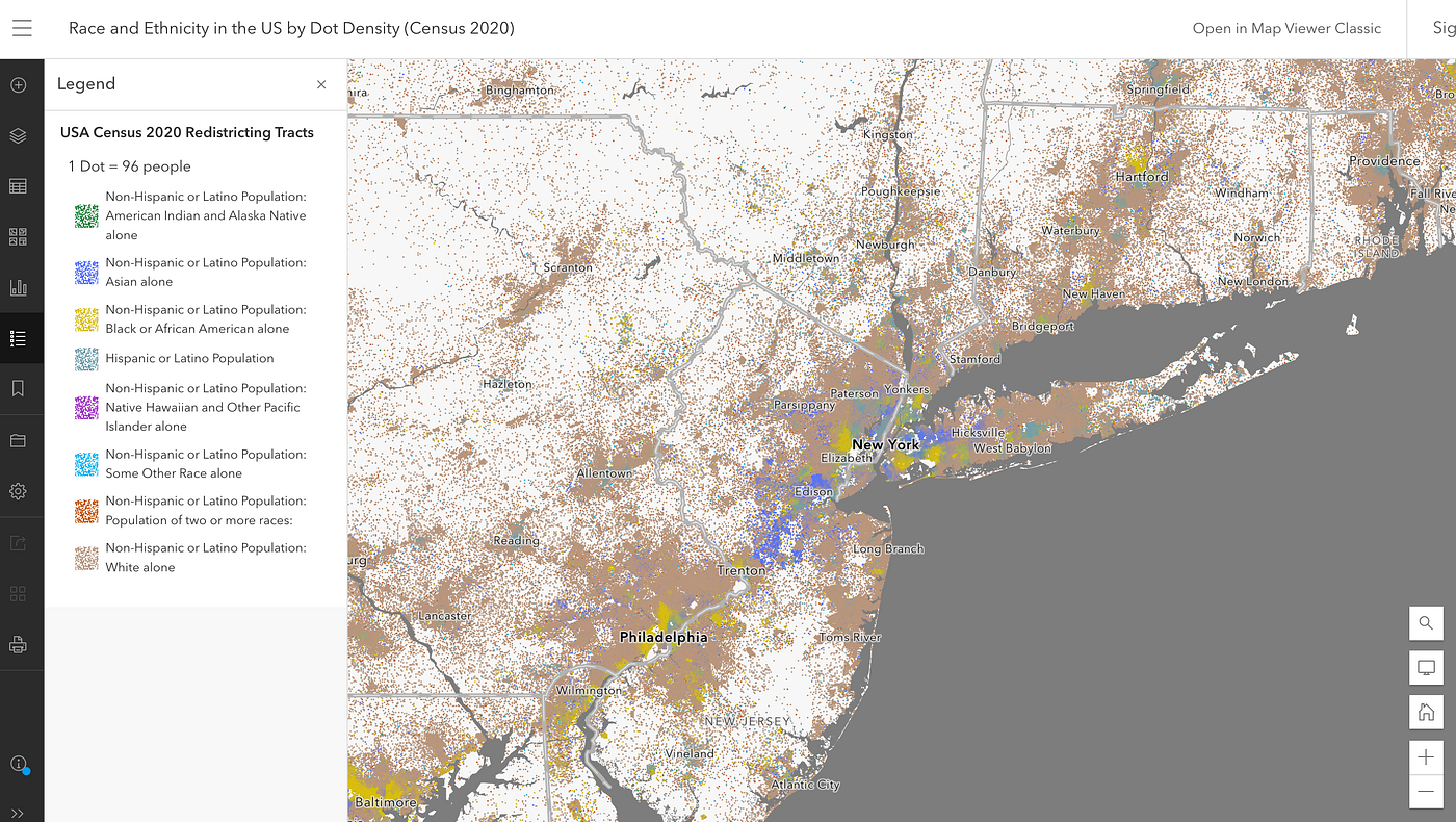
You may see different US racial/ethnic dot maps before, like the University of Virginia Racial dot map based on 2010 US Census Data. However, the dot map is not valid anymore and the map data is outdated. After that, there are several more dot maps created to map where different racial/ethnic groups of people live in the US. For example, ESRI has published the US race dot map (link),
CNN also has developed the US race/ethnicity map (Link).

There are several other racial/ethnic dot maps, like Wee People. However, if you checked those dot maps carefully, you may find they are giving your wrong information about where people live. Yes, those dots are randomly allocated in each census unit based on the census data and these are not the actual locations of people. And there is no way to know exactly where each individual live. But, I mean those dots are just too wrong to tell you about where people live. For example, here is the ESRI race dot map,


It seems that some people live in the cemetery and airport. I don't think US Census Bureau is able to count the ghost in their surveys. For the CNN dot map, you can see each dot represents 150 people. Those dots are coarsely distributed, and you cannot really zoom in and see a detailed distribution of where people live.
All of those maps cannot give you a full picture of where people really live. This is simply because none of those maps doesn’t consider that people actually live inside of buildings. In our Neighborhood Facts App, we generated much better dot maps to let you be able to examine where people live. We used the most recent US census data of 2021 and mapped where different racial/ethnic groups of people live in the US. We used tens of millions of individual building footprints in the US and restrict the population to building footprints, therefore, the racial/ethnic maps we created can better indicate where people actually live.


The dot map can be accessed through the mobile App on mobile devices, which makes it easier for you to check. Here are some screenshots of the dot map. Please note that the dot maps are at high zoom levels, therefore, you need to keep zooming in to switch from choropleth maps to dot maps. Welcome to download the App and take a look.


